

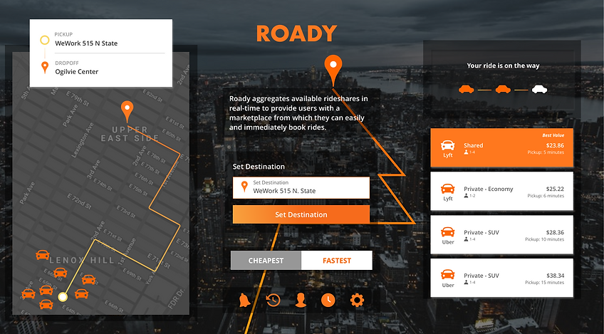
Roady
Roady is a rideshare aggregator startup whose main goal is to eliminate the stress and effort involved in finding the best ride.
This was a four-week project that I worked on as part of the program at Designation where each designer was tasked to build out the brand and the app’s visual design.
DETAILS OF THE PROJECT MAY BE VIEWED IN THE DESKTOP VERSION OF THE SITE.
FINAL SCREENS
DETAILS OF THE PROJECT MAY BE VIEWED IN THE DESKTOP VERSION OF THE SITE.
STYLE TILES
OVERVIEW
Roady came about after one of its founders experienced, on her way to work, the difficulty of having to open multiple ridesharing apps just to be able to compare the prices of rides in her area. She also knew that there were available cabs close by, but she didn’t have the Grab app and therefore couldn’t also compare their prices with the rideshare apps’ prices.
As a result of this experience, the founders of Roady thought of creating an app where all available ride information from the different rideshare and cab companies can be aggregated or collected into one convenient location — where, at a glance, the user will be able to find the best ride in terms of price, time to pickup/dropoff, or both.
THE PROJECT
ROLE
UI and UX
TOOLS
Sketch, InVision, Keynote, and desirability & usability testing
TIMELINE
4 weeks
DELIVERABLES
Key high-fidelity mobile screens and prototype, exploration and wireframes of competitive differentiators, style guide, UI kit, and testing results
PREPARATORY WORK
Before we proceeded with creating each of our initial design directions, my team made sure that we understood the current market landscape by looking at the overall domain, our direct and indirect competitors, as well as out-of-category brands and apps that we may draw inspiration from. We also made sure that we took into consideration our client’s own research and their overall direction for the brand.
STYLE EXPLORATION
During our kick-off meeting, we showed our clients several divergent style directions to figure out which ones they gravitated towards and which elements or items they had strong opinions about — to get an overall understanding of their aesthetics.


1
1
1
1
2
2
2
3
HIGHLIGHTS
Color. The clients have a strong connection with the color blue. They disliked orange for the app and they also did not like the boards with multiple colors.
Illustration. The clients have voiced their opinion about wanting to include some illustration in the app but not anything “cartoon-y”.
Others. The clients liked the boards with clean lines and that utilized a lot of white space. They liked the “personalized” elements from some of the boards.
Brand/App Affinity. When asked about some of the apps they gravitate towards in terms of interface design and ease-of-use, the clients named Airbnb, United, and Net-A-Porter.
1
2
3
4
VISUAL COMPETITIVE ANALYSIS
As part of our preparatory work, my team looked at the competitive landscape to explore any opportunities and identify any best practices. We looked at four of our main competitors, another four indirect competitors, and also a few out-of-category brands and apps for inspiration.
MAIN SCREEN AND MAPS

BELLHOP

MIGO

LYFT

UBER
Players in the market utilize the map to anchor their main screens and most, if not all, competitors use Google maps in their apps and customize them to fit their brand aesthetics.
DESIGN PRINCIPLES
The fundamental guidelines of our designs were a synthesis of our domain research and the guiding principles our clients have identified for the brand in the beginning.


Be (sufficiently) personal
Demonstrating we know our users without making them feel we are invading their privacy
Keep it familiar
Designing an app that looks and feels like ridesharing apps users are already familiar with
Talk visually
Displaying information with the aid of visuals to simplify the interface and user journey
USER PERSONA
Though somewhat broad, our user persona represents a segment of the population that uses rideshare services as their primary means of transportation or going around a city

-
Millennials from 18-38;
-
College-level students to
mid-career professionals;
-
Digital savvy;
-
Regular rideshare customer;
-
Price or time-sensitive
DESIGN EXPLORATION
Taking cues from our competitive analysis, our design principles, and from what we have gathered from our clients, I wanted to make sure that I created divergent design directions that would allow me to understand what our user persona really wants. Our clients created different brand personalities to describe Roady (e.g. secret service agent, favorite school teacher) and I wanted to explore which one resonated with our users the most.

STYLE TILE 1
My first style tile reflects a popular blue that is being used by various apps in the service space. This design direction is a callback to a couple of the brand’s personalities — a reliable best friend and an approachable favorite teacher: simple, clear, easy-to-use, and thorough.
STYLE TILE 2
This design direction takes cue from the secret agent brand personality with the dark UI, the sleek aesthetic, straight-forward font, and a strong anchor color.

STYLE TILE 3
The idea behind this tile is to differentiate Roady from its competitors — primarily by using an anchor color that is not being used in this particular space yet. This style also takes cue from that “favorite school teacher” brand personality with a simple, approachable, and easy-to-use interface.
DESIRABILITY TESTING METHODOLOGY & RESULTS
We conducted a test to gauge the design preferences of our user persona. The test was conducted at 1871, a non-profit digital startup incubator located in Chicago, IL. We tested with seven participants: five men, two women, all regular rideshare users — showed them three divergent style tiles each from four designers, asked them a set of questions, encouraged them to think aloud, asked them to rate each style tile individually and to point out their favorite between each designers’ three designs.
Four out of the seven participants preferred style tile 1, while two participants preferred style tile 2, and one liked style tile 3. Majority of the participants liked style tile 1 and pointed out its approachable, clear, clean, and user-friendly design. The other two tiles were more polarizing — with users either really liking one or the other and ranking them as their top choice or really disliking them and providing their corresponding negative feedback.
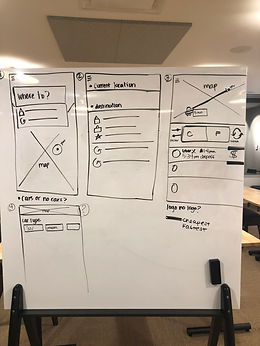
INITIAL HIGH-FIDELITY SCREENS
With a design direction in place, my team decided to begin work on creating each of our high-fidelity screens. Our plan was to create key screens that we can test out during this sprint and, the results from which, we can incorporate to build out the rest of our screens from.
To begin this process, we reviewed the draft screens from our clients, took note of the best practices of our competitors, and worked on sketching the wireframes of one specific user flow -- the core function of the app, finding and booking a ride:

1
2
3
4

5
6
7
8
USER FLOW LIST:
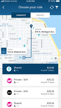
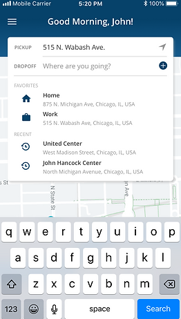
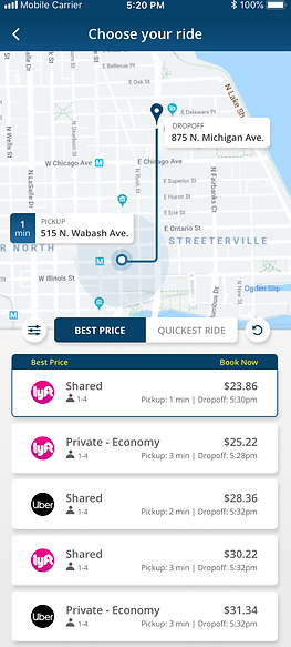
Home Screen - anchored by a map with the user's current location and a destination search bar
Search State - with an anticipative suggested destination function, as well as a list that includes "favorites"
Ride Options Screen - that includes the location of the nearest ride, list of options, and filters
Filter Screen - that allows the user to manipulate the ride options with instant results
Confirmation Screen - with a summary of the ride, payment information, and a confirmation button
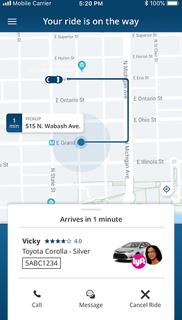
Driver Status Screen - that shows the user the driver's current location and pick-up progress/status
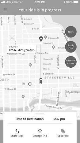
Ride-In-Progress Screen - that shows the user the current ride progress as well as some "in-ride" options
Post-Ride Screen - where the user can rate the driver/ride and add a tip
1
2
3
4
5
6
7
8
Based on the style direction that I took and the three key screens that the group decided to test (the ones that best represented the user flow and the app), I created the following:


In creating this design, I wanted to explore a way to distinguish Roady from the competitors but still maintain that overall look that anyone who uses any kind of app will be familiar with.
HIGHLIGHTS
Header. In the absence of a bottom navigation bar, I decided to build a header that will anchor each screen with the brand's color and that will also serve as a status bar to indicate where the user is at in the app.
Ride Options List. I decided to use cards for each available ride and have them appear to be floating by adding a drop shadow. This was to make sure that this important information is highlighted and that the user's attention is directed to the same. Using cards for this section also allows me to keep the information in this screen organized and easily digestible.
Status/Action Bar. Besides the header cum navigation bar, I decided to use the space for a secondary function — a supplementary status bar and an action bar (in this case, a sorting option) to highlight the status/use and to de-clutter the bottom portion of the screen (where other apps have placed the same)
1
2
For each screen, I made sure that all of the elements were intentional, have a clear use, and are properly labeled — if there is a risk of the context or use not being clear.
1
2
3
3
3
After my team presented to our clients our recommended style directions that mostly consisted a lighter blue color palette, the client reiterated their preference for the blue color — specifically, though, a darker or more navy blue.
But only one of the team members presented and tested a navy/dark blue style tile during the first round of testing so there was no way for us to know how the users would receive the darker blue color for the rest of the designers’ work. So based on this feedback, and in making sure that we covered all our bases and avoid missing any possible opportunities, we decided to create a second version of our key screens — in a darker blue color:


The exact same initial high-fidelity screens but only in a darker blue color
We tested both the light and the dark blue screens during this sprint.
DESIRABILITY & USABILITY TESTING METHODOLOGY & RESULTS
On top of testing between the lighter and darker blue colors, we conducted a test to gauge the design preferences of our users as well as the usability of our designs. The test was conducted at 1871, a non-profit digital startup incubator located in Chicago, IL.
We tested with eight participants: four men and four women, all regular rideshare users — showed them each of our three key screens in one color (either the lighter or the darker blue set), asked them a set of questions, and encouraged them to think aloud. Afterwards, we showed the participants the two color blue versions of the screens and asked them which one their preference is and if they had any additional feedback.
All eight participants preferred the darker blue version of the screens and had the following feedback:

The darker blue color offered more contrast against the different elements on the screen
Users liked familiar-looking maps like Google and Apple maps

Users liked the level of detail on the screens, citing the radar image and the re-center icon as a couple of examples
Users preferred clear labeling on the map — especially to reinforce the pickup and dropoff points
Users preferred seeing the logo of the rideshare apps vs. just a text representation — it allowed them to digest the information a lot easier

Users liked the usage of a header and thought it was a great opportunity for branding
Users liked the use of cards and the hierarchy of information within as it made reading the information easier
Users preferred having all of the actionable elements of the app in one area of the screen — at the bottom along with the rest of the actionable items
Users pointed out the importance of clear labelling — especially if there is a risk of the context being unclear
Users preferred to see an image of a car rather than the logo — and thought it was unnecessary as it was already established prior and it is also indicated at the bottom portion of the screen
FINAL PROTOTYPE
Our decision to test out a darker blue version of our key screens in the prior sprint turned out to be a great idea. We did not only make the client happy by validating their preferred color but, ultimately, it ended up being the color that users gravitated towards the most.
With the feedback from the last user testing, and with the following client’s inputs that were mostly already present in my designs:
- The use of sleeker cars in the map;
- A map that is more muted and matches the overall look of the app;
- Consistent branding elements;
- Visually presenting in one easily digestible section the driver’s car, photo, and rideshare company logo;
- A modern but approachable font;
- Clear labeling and iconography, especially the route of the ride in the map
...I created my final screens:
...and the final InVision (clickable) prototype:

HOME/MAIN SCREEN

HIDDEN SIDE BAR/MENU
DROPOFF SEARCH STATE
RIDE OPTIONS SCREEN


CONFIRMATION SCREEN
FILTER SCREEN
DRIVER STATUS SCREEN

RIDE IN PROGRESS SCREEN
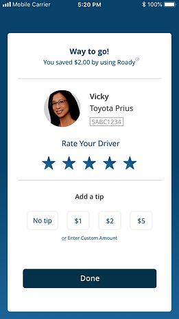
POST RIDE SCREEN
EXPLORATION AND WIREFRAMES OF COMPETITIVE DIFFERENTIATORS
With enough time to deliver an extra item on the client's wishlist, we decided to come up with potential competitive differentiators, wireframe them, and include the same in the last user testing that we conducted.
QUIET RIDE
IN-APP NEWS
ROADY CHAT
ALTERNATE ROUTES
RIDE AMENITIES
All of these concepts that we tested to differentiate Roady from its competitors were sent to the client, along with our other final deliverables, for further exploration and future consideration. This process, though not part of the original scope of the project, proved to be a worthwhile activity for both our client and our team. It allowed us to employ our UX knowledge and challenged our creativity, and it also helped further the client's progress to releasing a beta version of their app.
OTHER FINAL DELIVERABLES
On top of the final high-fidelity screens and the concept-tested competitive differentiators, I also provided our client with the following assets:
- Final prototype with walkthrough;
- Style guide;
- UI kit;
- Test notes and presentation decks


DESCRIPTION
This feature allows passengers to request for a "quiet ride" prior to the actual ride commencement — for a variety of reasons like a business or personal call, intending to work or study during the ride, etc.
FEEDBACK
Six out of the eight users tested said they loved this idea and would use this feature. The other two users were indifferent or did not have a strong opinion about this feature either way. The main concern for most of the users were making sure that this is implemented properly without making it uncomfortable for both the passenger and the driver.


DESCRIPTION
This feature occurs when the ride is already in progress. It allows the user to read the news from different outlets without exiting the app and it can be accessed right on the main screen.
FEEDBACK
This feature was split in half with four of the eight users stating they would use this and the other four stating otherwise. User who said they would use this liked the convenience of having this right in the app. On the flipside, those who said they would not use this mentioned already using a different app for their news and didn't find this useful.


DESCRIPTION
This feature was actually one of the things our client mentioned that they wanted to include in the app to differentiate Roady from the competitors. We built out the concept where the user will be able to see and engage with their friends or connections who are also enroute somewhere — while the ride is in progress.
FEEDBACK
As much as the team didn't think this feature would be received well, it would be a disservice to our client and the users if we didn't test this out. With that said, none of the users tested thought they would use this feature — with most saying that they'll just open up the app they usually use to connect with friends if they have to.

DESCRIPTION
While the ride is in progress, this feature allows the users to check alternative routes, in case the need arises (for things like traffic, re-routes, etc), right from within the app.
FEEDBACK
Only three out of the eight users tested showed interest in this feature. Majority of those who said they will not use this thought there would be very little use for the need to search for an alternative route and assumes the app automatically chooses the best route to their desitnation.
DESCRIPTION
While waiting for their ride to reach their location, this feature will allow the users to check what amenities, if any, their ride provides. From a mobile charger to bottled water, passengers will be able to access this information easily from the same screen that shows where their driver's location is at.
FEEDBACK
This feature was also split in half with four out of the eight users stating it would be nice to know this information in advance while the other half thought that the information is not that important to know and they will be fine without it.

STYLE GUIDE


View the full style guide here
CONCLUSION
Roady was my second client experience with Designation. Compared to the first one, though, this phase allowed us to engage and work with the clients directly, on our own, from start to finish. The process by which this phase was carried out also imitated "real-world" scenarios with a proper kick-off meeting, weekly sprints, and an official handoff.
On top of the challenges and learnings enumerated throughout this section, I also realized in this phase how invaluable my career experience and background in brand management and marketing really is. I was able to harness these skills by creating unique and professional designs that were not only user-centric but were also client-focused.
I understood the importance of having a strong and consistent brand visual identity — that it has a strong correlation with the user's positive experience and that it can only improve even an already good and pleasurable-to-use product.
Team Roady. My team with the co-founders of rideshare-aggregation startup app, Roady,
Austin Jenkins (left) and Rebecca Klor (third from right)
